Vela
Forecasts for everyone
Overview
Vela is an app concept that I designed during a 400 - hour UX Design course with Career Foundry. The goal was to identify functionalities and needs that were not found in the existing market. This was achieved through research, testing, and designing. In this project, I utilized my newfound skills from Lingo & You and improved them. Creating mockups, prototyping, usability testing, and design refinement.
My Process
Research
During the initial stages of research, I discovered other forecasting apps did not provide any information for hazardous conditions. One of my goals was to create a section in the app to provide users with information about specific conditions. (Weather, Animal Sightings, Lifeguard on Duty) I hypothesized that updating the app with safety conditions, it will inform the public ahead of time and keep them safe on their day out on the beach.
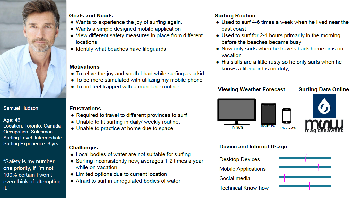
Once I identified areas that could be improved on based on market research I developed a hypothesis. Next, it was time to interview users to gain more information. (For a list of the questions asked in the preliminary interviews Click Here) After conducting interviews with both surfing enthusiasts and everyday individuals stuck in the city, I was able to create user flows and personas to bring our ideal users to life.


Ideation
Before I could begin drafting an early design more research was done in the form of card sorting to understand how everyday users would categorize Vela's content. Card sorting was completed digitally using Optimal Sort. The image below helped pave the way for the first low-fidelity prototypes.

Wireframes
From the user flow and site map created above, low-fidelity prototypes were developed to help capture how a user would go about achieving those desired goals with Vela. Below are some early mockups of Vela.

This draft was later brought to life using Adobe XD. Shapes and grids were outlined to determine where information would be placed later on.

Testing
Once the framework of the app was developed, user testing was conducted to evaluate how well participants could complete the tasks I asked of them. The testing process consisted of gathering the participant’s thoughts and feelings on the early stages of the design, and how simple each task could be to complete (To view the test script and questions Click Here.) These were some of the screens that were assessed throughout the usability test. The focus was on the content and flow of the screens and not the overall aesthetic of the app.

Over the course of usability testing, the user’s thoughts and feelings were recorded on a sticky note and placed on a whiteboard. Similar thoughts and quotes were groped together to organize the information using affinity mapping.

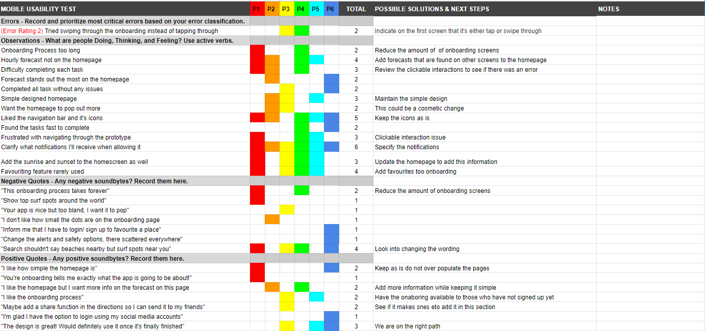
With the affinity mapping complete the most grouped statements were broken into categories and put in an excel sheet where they would be scored.

Refine Design
With the user testing complete it was time to review the feedback and bring the app to life by creating a beautiful user interface. One of the more important design choices was adding shadows to make the content pop from the background.

Try it Yourself
Conclusion
After spending countless months working on this app one of the most valuable lessons I learned from this process was to value the feedback from my users and not to take advantage of the low and mid-fidelity prototypes. There were stages where I had to iterate new design concepts later on in the project which was frustrating and time-consuming. Also for future projects, I will also look to analyze more than two competitors to get a feel of the overall market.
